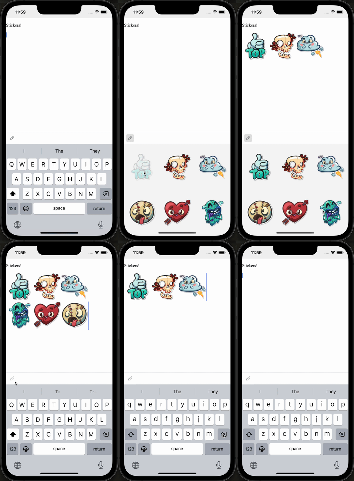
Custom Keyboard
In this example we will create and add a custom sticker keyboard 👯♀️ Im going to show parts of the code we have on the Full solution and go into small chunks of the code.

First, let's create a new CustomKeyboard
...

const StickerRow = ({ stickers }: { stickers: string[] }) => {
  return (
    <View
      style={{
        flex: 1,
        flexDirection: 'row',
        justifyContent: 'center',
        alignItems: 'center',
      }}
    >
      {stickers.map((sticker, index) => (
        <TouchableOpacity
          key={index}
          style={{ flex: 1, alignItems: 'center', justifyContent: 'center' }}
          onPress={() => EditorHelper.editorLastInstance?.setImage(sticker)}
        >
          <Image
            source={{ uri: sticker }}
            style={{ width: 100, height: 100 }}
          />
        </TouchableOpacity>
      ))}
    </View>
  );
};

const StickerKeyboardComp = () => {
  return (
    <View style={keyboardStyles.keyboardContainer}>
      <StickerRow stickers={stickersTop} />
      <StickerRow stickers={stickersBottom} />
    </View>
  );
};

export const StickerKeyboard = new CustomKeyboardExtension(
  'keyboard.sticker',
  StickerKeyboardComp
);

...
- We create here
StickerKeyboardCompwhich is the react native view of the keyboard that will be rendered inside our custom keyboard - On each sticker we have
onPress={() => EditorHelper.editorLastInstance?.setImage(sticker)}EditorHelper is a shared class that hold the instance of EditorBridge, so each time user presses a sticker it will callsetImage - Lastly we create new CustomKeyboardExtension, this part is important so it will register our View as a custom keyboard with
keyboard.stickeras its id.
Now we can use our custom keyboard
...
export const CustomKeyboardExample = () => {
  const editor = useEditorBridge({
    avoidIosKeyboard: true,
    autofocus: true,
    DEV: true,
    bridgeExtensions: [
      // It is important to spread StarterKit BEFORE our extended plugin,
      // as plugin duplicated will be ignored
      ...TenTapStartKit,
      ImageBridge.configureExtension({
        inline: true,
      }),
    ],
  });
  const TapRef = useRef(null);
  const [activeKeyboard, setActiveKeyboard] = React.useState<string>();

  return (
    <SafeAreaView style={exampleStyles.fullScreen} ref={TapRef}>
      <View style={exampleStyles.fullScreen}>
        <RichText editor={editor} />
      </View>
      <KeyboardAvoidingView
        behavior={Platform.OS === 'ios' ? 'padding' : 'height'}
        style={exampleStyles.keyboardAvoidingView}
      >
        <StickerToolbar
          activeKeyboard={activeKeyboard}
          setActiveKeyboard={setActiveKeyboard}
          editor={editor}
        />
        <CustomKeyboard
          rootRef={TapRef}
          activeKeyboardID={activeKeyboard}
          setActiveKeyboardID={setActiveKeyboard}
          keyboards={[StickerKeyboard]} // <-- Add our custom keyboard to the keyboards prop
          editor={editor}
        />
      </KeyboardAvoidingView>
    </SafeAreaView>
  );
};
...
Here we add our keyboard to our editor
TapRefcreate a ref and add it to some View in your app, to the View that wrap the editor- Create a react state that will control which custom keyboard is shown
- Render CustomKeyboard and pass all props
Add button that will toggle our custom keyboard
...
const StickerToolbar = ({
  editor,
  activeKeyboard,
  setActiveKeyboard,
}: ToolbarWithColorProps) => {
  // Get updates of editor state
  const editorState = useBridgeState(editor);

  const { isKeyboardUp: isNativeKeyboardUp } = useKeyboard();
  const customKeyboardOpen = activeKeyboard !== undefined;
  const isKeyboardUp = isNativeKeyboardUp || customKeyboardOpen;

  // Here we make sure not to hide the keyboard if our custom keyboard is visible
  const hideToolbar =
    !isKeyboardUp || (!editorState.isFocused && !customKeyboardOpen);

  return (
    <Toolbar
      editor={editor}
      hidden={hideToolbar}
      items={[
        {
          onPress: () => () => {
            const isActive = activeKeyboard === StickerKeyboard.id;
            if (isActive) editor.focus();
            setActiveKeyboard(isActive ? undefined : StickerKeyboard.id);
          },
          active: () => activeKeyboard === StickerKeyboard.id,
          disabled: () => false,
          image: () => Images.palette,
        },
      ]}
    />
  );
};
...
Creating a way to open and close the custom keyboard can be tricky because we have two states, the native keyboard state and our custom keyboard state
const { isKeyboardUp: isNativeKeyboardUp } = useKeyboard();useKeyboard is a util the lib provides that lets us know when the native keyboard is up- That way we can now when to hide toolbar
hideToolbar - We will use Toolbar component and will render only one item that will toggle our custom keyboard
- In case someone toggles the custom keyboard again we need to refocus the editor. So we add
if (isActive) editor.focus();
Full solution
import type { NativeStackScreenProps } from '@react-navigation/native-stack';
import React, { useRef } from 'react';
import {
  SafeAreaView,
  View,
  KeyboardAvoidingView,
  Platform,
  StyleSheet,
  TouchableOpacity,
  Image,
} from 'react-native';
import {
  RichText,
  Toolbar,
  useBridgeState,
  useEditorBridge,
  useKeyboard,
  type EditorBridge,
  TenTapStartKit,
  ImageBridge,
  EditorHelper,
  CustomKeyboardExtension,
  Images,
} from '@10play/tentap-editor';
import { CustomKeyboard } from '../../../../src/RichText/Keyboard/CustomKeyboardBase';

const keyboardStyles = StyleSheet.create({
  keyboardContainer: {
    alignItems: 'center',
    justifyContent: 'center',
    flex: 1,
    width: '100%',
    height: '100%',
  },
});

const stickersTop = [
  'https://res.cloudinary.com/dkofpy6k6/image/upload/c_fill,g_auto,h_100,w_100/v1707657614/7c1d68c9-126c-4967-a6a4-7252e998802d.png',
  'https://res.cloudinary.com/dkofpy6k6/image/upload/c_fill,g_auto,h_100,w_100/v1707657441/skel_uv9mo1.png',
  'https://res.cloudinary.com/dkofpy6k6/image/upload/c_fill,g_auto,h_100,w_100/v1707657821/ecee86ed-6291-412c-9570-2b561314d723.png',
];
const stickersBottom = [
  'https://res.cloudinary.com/dkofpy6k6/image/upload/c_fill,g_auto,h_100,w_100/v1707658182/53b06114-544c-4048-869f-fedbc6d51bb9.png',
  'https://res.cloudinary.com/dkofpy6k6/image/upload/c_fill,g_auto,h_100,w_100/v1707658198/75fe11eb-1d93-45e4-bb97-d8e26dbe4335.png',
  'https://res.cloudinary.com/dkofpy6k6/image/upload/c_fill,g_auto,h_100,w_100/v1707658214/c6cadcf3-785c-49ec-b34d-c6d8ea544153.png',
];

const StickerRow = ({ stickers }: { stickers: string[] }) => {
  return (
    <View
      style={{
        flex: 1,
        flexDirection: 'row',
        justifyContent: 'center',
        alignItems: 'center',
      }}
    >
      {stickers.map((sticker, index) => (
        <TouchableOpacity
          key={index}
          style={{ flex: 1, alignItems: 'center', justifyContent: 'center' }}
          onPress={() => EditorHelper.editorLastInstance?.setImage(sticker)}
        >
          <Image
            source={{ uri: sticker }}
            style={{ width: 100, height: 100 }}
          />
        </TouchableOpacity>
      ))}
    </View>
  );
};

const StickerKeyboardComp = () => {
  return (
    <View style={keyboardStyles.keyboardContainer}>
      <StickerRow stickers={stickersTop} />
      <StickerRow stickers={stickersBottom} />
    </View>
  );
};

export const StickerKeyboard = new CustomKeyboardExtension(
  'keyboard.sticker',
  StickerKeyboardComp
);

const exampleStyles = StyleSheet.create({
  fullScreen: {
    flex: 1,
  },
  keyboardAvoidingView: {
    position: 'absolute',
    width: '100%',
    bottom: 0,
  },
});

export const CustomKeyboardExample = ({}: NativeStackScreenProps<
  any,
  any,
  any
>) => {
  const editor = useEditorBridge({
    avoidIosKeyboard: true,
    autofocus: true,
    bridgeExtensions: [
      ...TenTapStartKit,
      ImageBridge.configureExtension({
        inline: true,
      }),
    ],
  });
  const TapRef = useRef(null);
  const [activeKeyboard, setActiveKeyboard] = React.useState<string>();

  return (
    <SafeAreaView style={exampleStyles.fullScreen} ref={TapRef}>
      <View style={exampleStyles.fullScreen}>
        <RichText editor={editor} />
      </View>
      <KeyboardAvoidingView
        behavior={Platform.OS === 'ios' ? 'padding' : 'height'}
        style={exampleStyles.keyboardAvoidingView}
      >
        <StickerToolbar
          activeKeyboard={activeKeyboard}
          setActiveKeyboard={setActiveKeyboard}
          editor={editor}
        />
        <CustomKeyboard
          rootRef={TapRef}
          activeKeyboardID={activeKeyboard}
          setActiveKeyboardID={setActiveKeyboard}
          keyboards={[StickerKeyboard]} // Add our custom keyboard to keyboards prop
          editor={editor}
        />
      </KeyboardAvoidingView>
    </SafeAreaView>
  );
};

interface ToolbarWithColorProps {
  editor: EditorBridge;
  activeKeyboard: string | undefined;
  setActiveKeyboard: (id: string | undefined) => void;
}
const StickerToolbar = ({
  editor,
  activeKeyboard,
  setActiveKeyboard,
}: ToolbarWithColorProps) => {
  // Get updates of editor state
  const editorState = useBridgeState(editor);

  const { isKeyboardUp: isNativeKeyboardUp } = useKeyboard();
  const customKeyboardOpen = activeKeyboard !== undefined;
  const isKeyboardUp = isNativeKeyboardUp || customKeyboardOpen;

  // Here we make sure not to hide the keyboard if our custom keyboard is visible
  const hideToolbar =
    !isKeyboardUp || (!editorState.isFocused && !customKeyboardOpen);

  return (
    <Toolbar
      editor={editor}
      hidden={hideToolbar}
      items={[
        {
          onPress: () => () => {
            const isActive = activeKeyboard === StickerKeyboard.id;
            if (isActive) editor.webviewRef.current?.requestFocus();
            setActiveKeyboard(isActive ? undefined : StickerKeyboard.id);
          },
          active: () => activeKeyboard === StickerKeyboard.id,
          disabled: () => false,
          image: () => Images.palette,
        },
      ]}
    />
  );
};